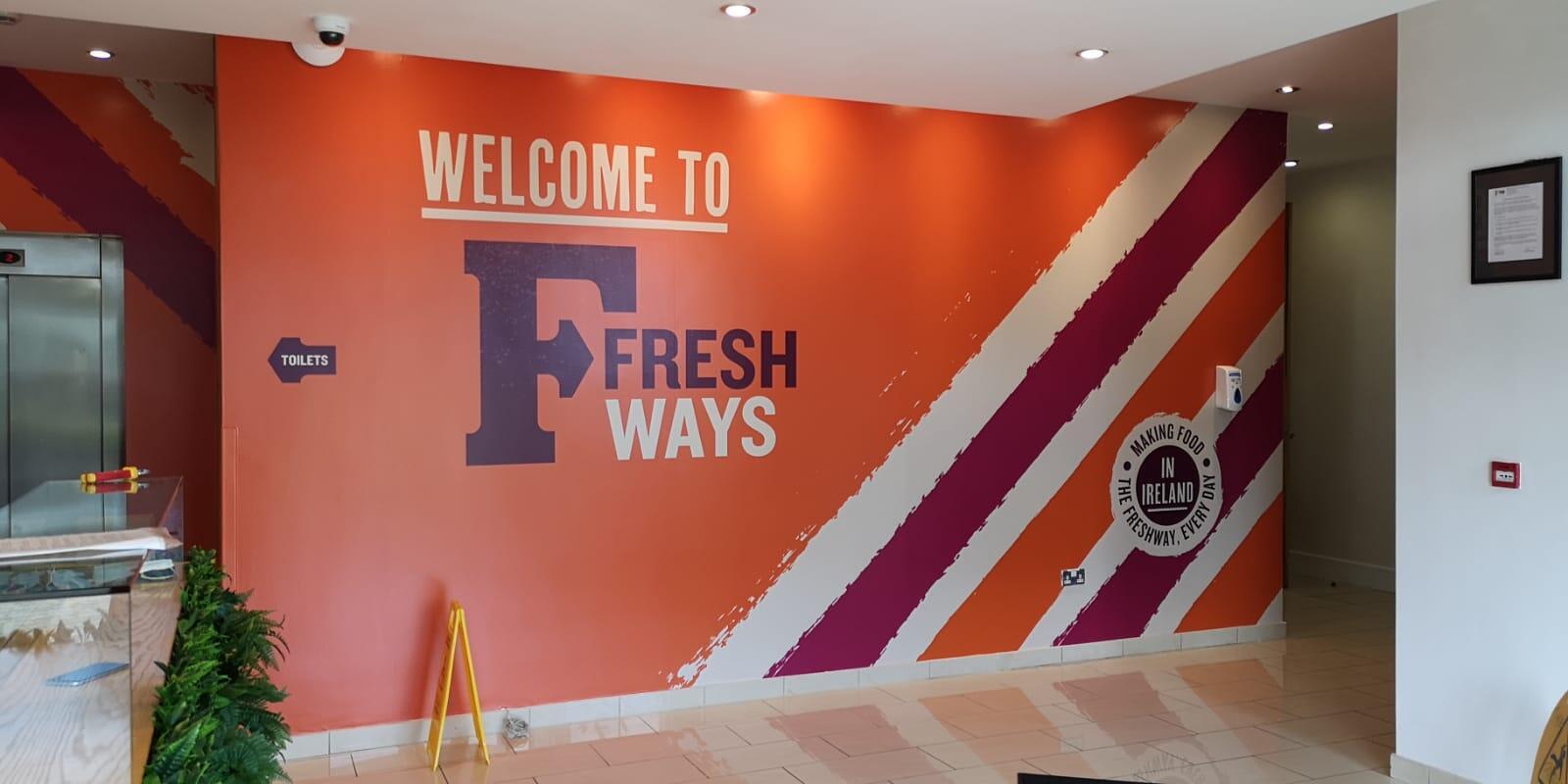
Design Tips for your Wall Graphics
Your workplace is more than desks, meeting rooms and corridors. It is an opportunity to showcase your brand, communicate your values and create an environment that people want to spend time in.
Office wall graphics are a simple and versatile way to transform blank walls into engaging branded spaces. From company values and inspirational quotes to bold graphics, photography and wayfinding, wall graphics can help businesses make better use of their interior spaces while creating a stronger connection with employees, customers and visitors.
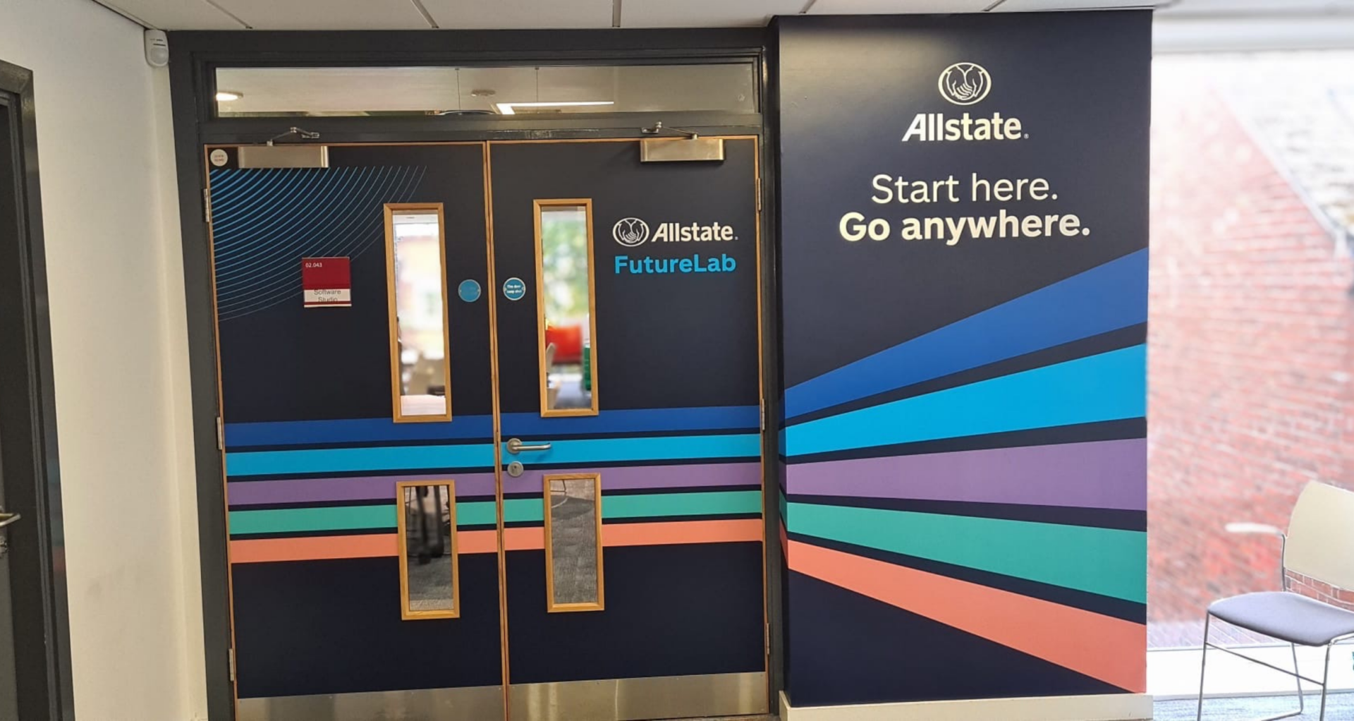
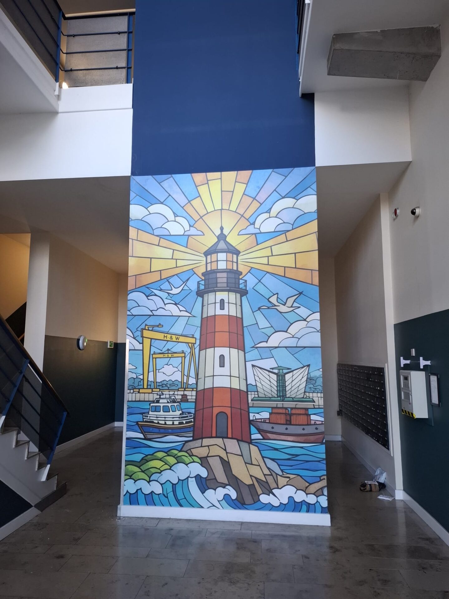
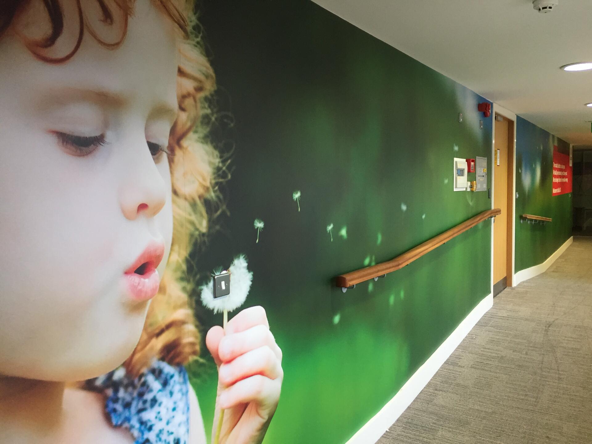
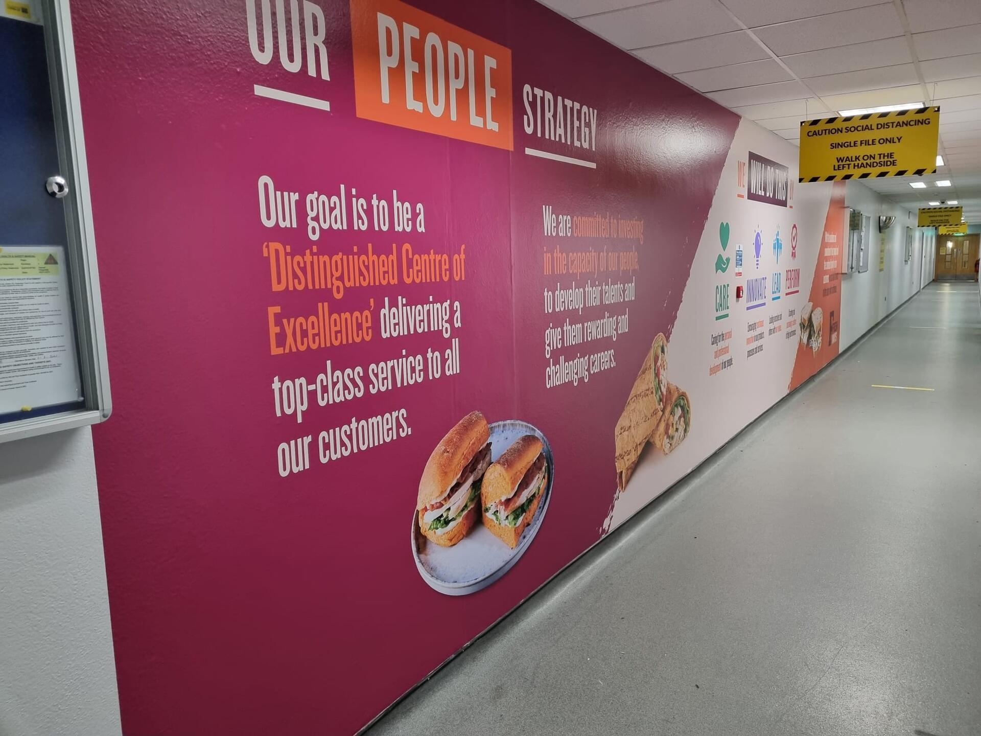
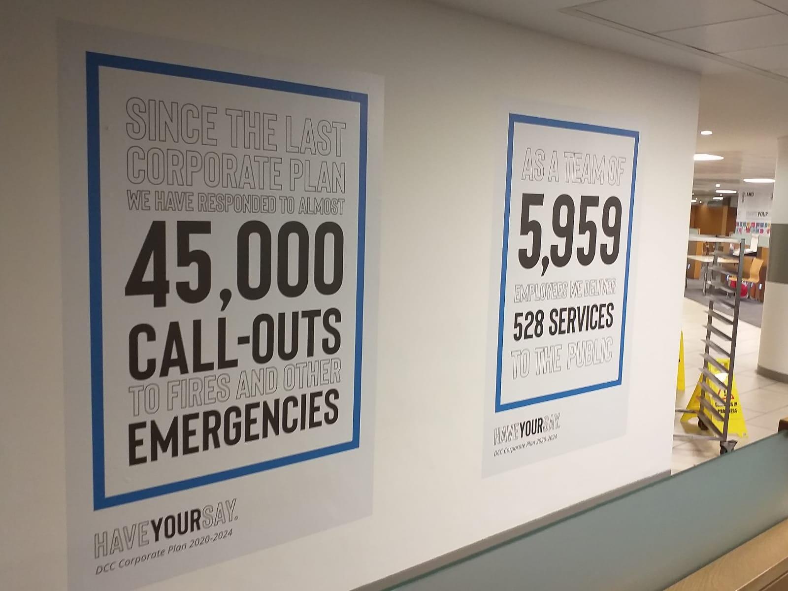
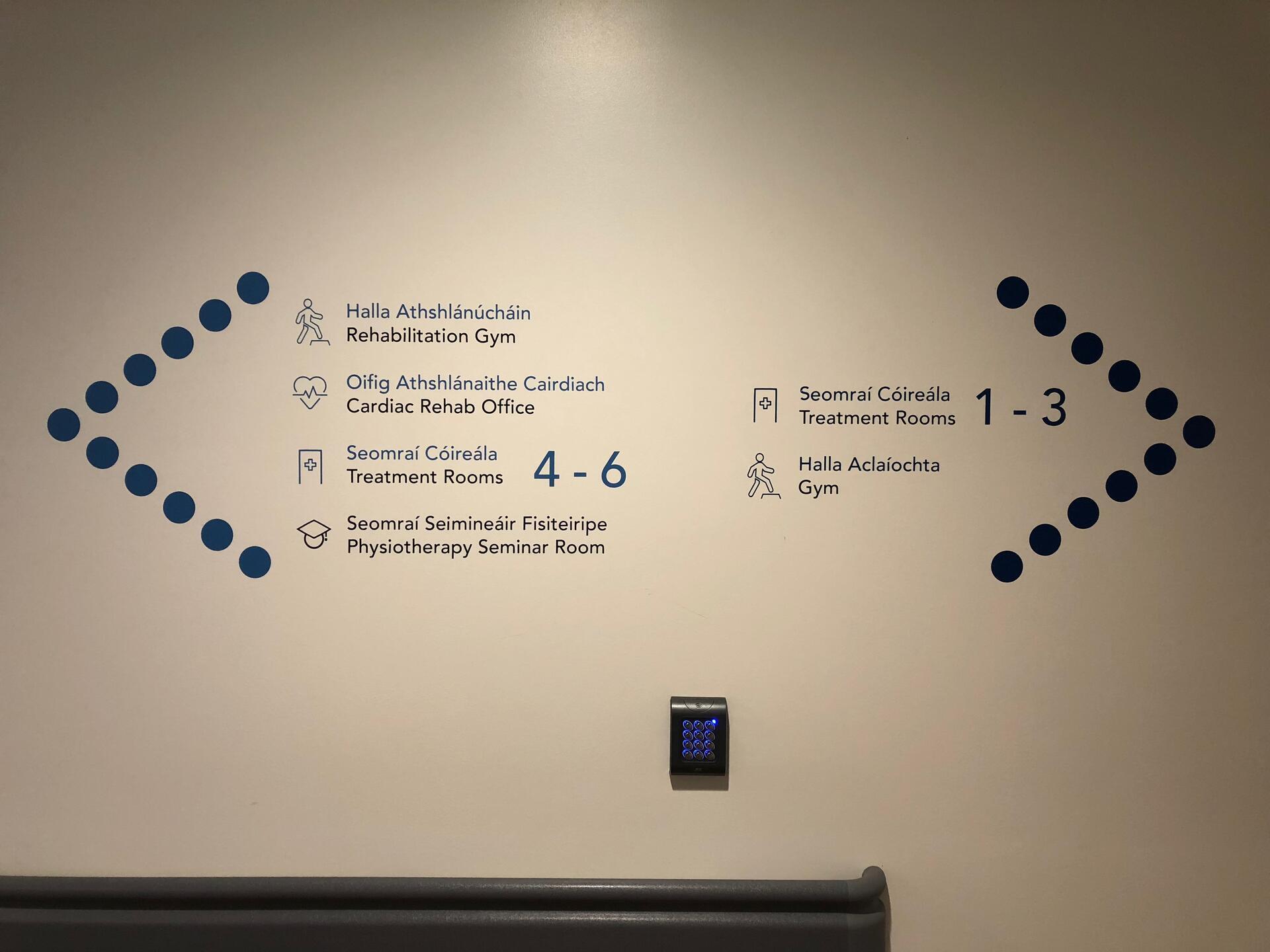
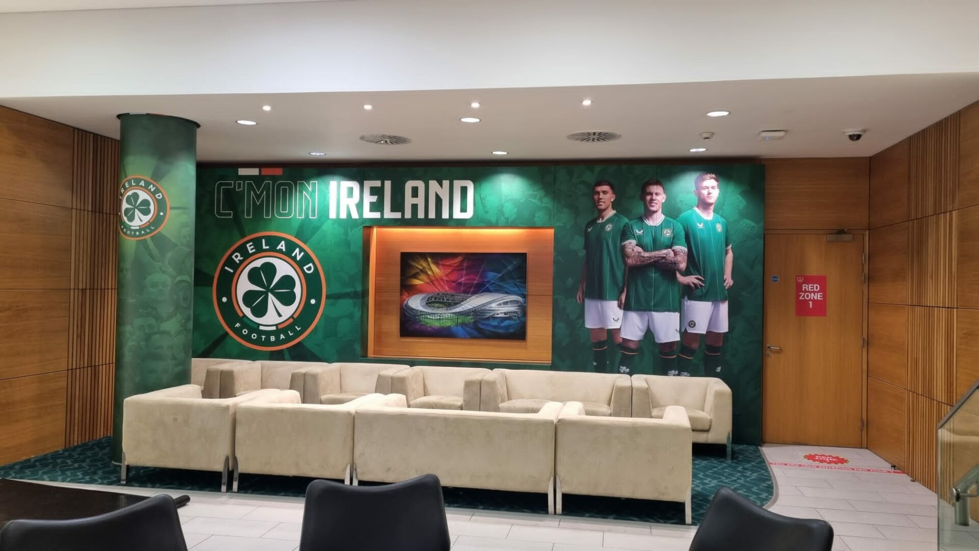
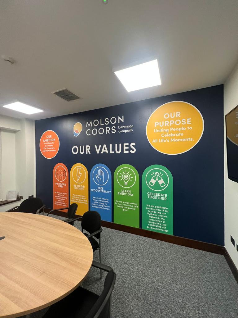
1. Start with the purpose of your wall graphics
Before thinking about colours, images or fonts, think about what you want your wall graphics to achieve.
Are you trying to:
- Strengthen your brand?
- Create an eye-catching feature wall?
- Communicate your company values?
- Tell your company’s story?
- Improve wayfinding?
- Create a more engaging workplace?
- Promote a product or campaign?
- Add personality to an otherwise plain space?
Having a clear purpose will make the design process much easier.
For example, a reception wall might be designed to make a strong first impression, while graphics in a corridor could be used to communicate information or tell a story.
2. Consider the size of the wall
One of the biggest mistakes when designing large-format graphics is forgetting just how different something can look when it’s scaled up.
A design that looks great on a computer screen might feel very different when it covers a wall several metres wide.
Before creating the artwork, consider:
- The width and height of the wall
- Doors, windows and other features
- The distance people will view the graphics from
- The size of important text and logos
- How the design will sit within the surrounding space
Large walls give you plenty of room to be creative, but that doesn’t necessarily mean you need to fill every inch.
Sometimes a simple, well-positioned design can have much more impact than a wall packed with graphics.
3. Think about your surroundings
Your wall graphics need to work within the space around them.
Consider the existing:
- Furniture
- Flooring
- Lighting
- Colours
- Signage
- Architecture
- Fixtures and fittings
For example, a brightly coloured graphic might work perfectly in a modern breakout area but feel out of place in a more understated reception.
Think about the overall environment rather than designing the wall in isolation.
The aim should be for the graphics to feel like a natural part of the space.
4. Use your brand, but don’t overdo it
Wall graphics are a great opportunity to bring your brand into your physical environment.
Your brand colours, typography, imagery and visual style can all be incorporated into the design.
However, branding doesn’t always mean putting your logo everywhere.
Consider how you can use your brand more creatively.
You could incorporate your colours into a large-scale graphic, use brand typography for a quote or message, or create a pattern inspired by your existing visual identity.
A strong piece of wall graphics should feel branded without necessarily looking like a giant advertisement.
5. Keep text simple and easy to read
If you’re incorporating text into your wall graphics, remember that walls aren’t brochures.
People may only have a few seconds to take in the information, particularly in busy areas such as reception spaces and corridors.
Keep important messages short and make sure the text is large enough to be read from the intended viewing distance.
Think carefully about:
- Font size
- Font choice
- Contrast
- Line spacing
- The amount of text
- Where the text is positioned
If your design includes a longer piece of information, consider whether it would be better displayed across several areas rather than trying to fit everything onto one wall.
6. Choose the right imagery
Photography, illustrations and other imagery can make a wall graphic much more engaging, but image quality is particularly important when you’re printing at a large scale.
A photograph that looks sharp on your phone or laptop may not necessarily be suitable for printing several metres wide.
Think about:
- Image resolution
- Image quality
- Composition
- Colour
- How the image will be cropped
- Where important parts of the image sit on the wall
If you’re using photography, make sure you have permission to use the images and that they are suitable for commercial use.
7. Don’t forget the shape of the wall
Not every wall is a simple rectangle.
Doors, windows, columns, sockets, switches and other architectural features can all affect the final design.
Rather than treating these as obstacles, consider how they can become part of the design.
For example, a graphic could be designed to flow around a doorway or use a column as part of the overall composition.
This is where bespoke wall graphics can really make a difference. The artwork can be designed specifically around the space rather than trying to make a standard design fit.
8. Consider the wall surface
The wall itself is just as important as the artwork.
Different surfaces can require different materials and installation methods. A smooth painted wall may be suitable for a standard adhesive vinyl, while textured or uneven surfaces may require a different solution.
Before production begins, it’s worth considering:
- Is the surface smooth?
- Is the paintwork in good condition?
- Is the wall clean and dry?
- Is there existing wallpaper or paint?
- Will the surface need preparation?
- Are there areas that are likely to receive heavy contact?
Choosing the right material for the surface will help achieve a better-quality finish and improve the longevity of your wall graphics.
9. Think about durability
Not every wall graphic needs to last for the same length of time.
A permanent piece of workplace branding might need to remain in place for several years, while graphics for a temporary campaign or event may only be required for a few weeks or months.
Think about how long you expect the graphics to be in place and how much wear and tear they are likely to receive.
High-traffic areas, corridors and spaces where walls are frequently touched or cleaned may require a more durable solution than a quieter office environment.
10. Consider how the graphics will be installed
The installation process is another important consideration when designing your wall graphics.
Large-scale graphics may need to be produced in sections, particularly when covering very large walls. The design needs to take this into account so that joins are positioned carefully and the overall image remains seamless.
Installation can also be affected by:
- Access to the wall
- Furniture
- Fixtures and fittings
- Working height
- Room layout
- The condition of the surface
Considering installation at the design stage can help avoid problems later.
11. Design for the people using the space
It’s easy to design wall graphics around what looks good in an artwork file, but don’t forget the people who will actually use the space.
Think about what your employees, customers or visitors will see as they move around the building.
A corridor could become a company timeline. A meeting room could feature a bold brand statement. A breakout area could use colourful graphics to create a more relaxed atmosphere.
The most successful workplace wall graphics aren’t just decorative. They contribute to the experience of being in the space.
12. Think beyond the logo
A logo is an important part of your brand, but it doesn’t have to be the centrepiece of every wall.
There are plenty of other ways to bring your identity into your environment.
Consider using:
- Brand colours
- Typography
- Patterns
- Photography
- Illustrations
- Quotes
- Company values
- Statistics
- Milestones
- Employee stories
- Product imagery
This can create a much more interesting and sophisticated branded environment than simply repeating your logo.
13. Consider the bigger picture
If you’re installing wall graphics throughout a building, think about how the different areas work together.
You don’t necessarily want every wall to look identical, but there should be a visual connection between the spaces.
For example, you could use a consistent colour palette and typography throughout the building, while giving different areas their own graphics and messaging.
This creates a workplace that feels cohesive without becoming repetitive.
Got a project in mind?
Get in contact today! We’d be happy to give any advice or a free quotation.